|
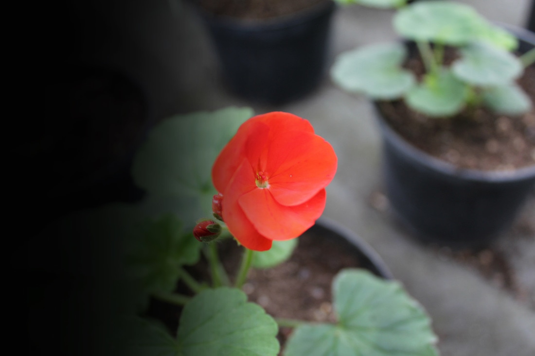
This photo, like many of the other artists' work, is of flowers, close enough to see the texture of the flower and all the petal shapes and curves. The colours are bright and vibrant, with the image having an interesting composition as screen is nearly, but not quite, covered by the picture of the flower with the background blurred out, keeping focus on the flower itself.
|
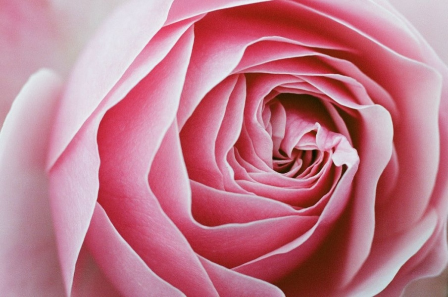
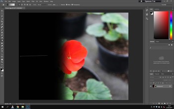
This photo is very interesting as it contrasts from light and dark. The flower itself expresses detail from the amount of curves and bends in the petals. Another factor of what makes this photograph's composition interesting is that the flower fades from light to dark (or dark to light depending on how you look at it). This can perhaps carry some deeper meaning behind the image, like the notion that people often keep their qualities in the dark and when they finally show them, the light reveals their inner beauty and qualities and intricacies.
I created my own version of this using a photo I took for the Jacky Parker shoot.
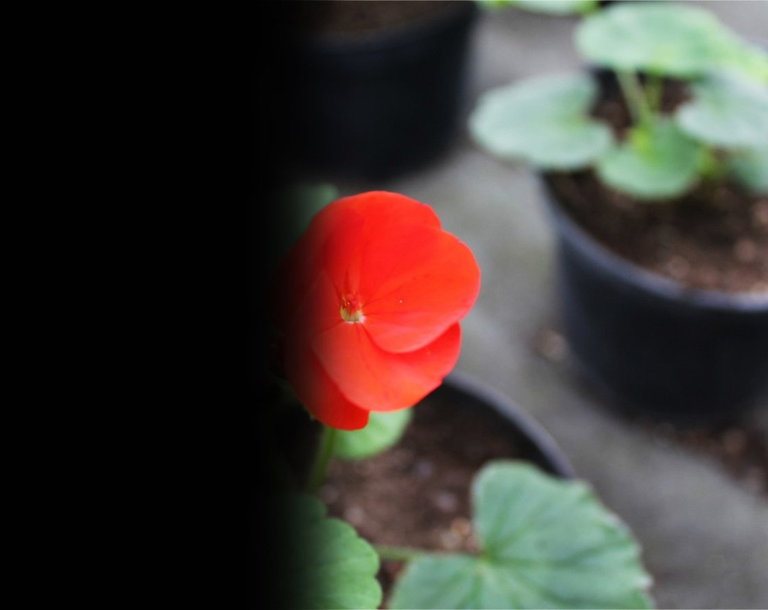
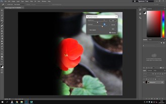
I did this by opening the image in Adobe Photoshop and adjusting the the brightness levels as well as the contrast to really make the different colours pop out and be clearly distinguishable. This made the light side of the photo much more of a contrast to the dark fade on the left side of the image. I also used the gradient tool to create the fade into darkness. I started with 100% opacity but then moved on to 50%.
|
|
|
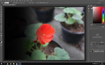
This is the final image in the style of Oswald. It mirrors the fade to black seen in her photograph above. Despite not being taken in the same way, the photograph still features a flower as the main subject in the photo. It is far more colourful than Yvonne's image above, and also much more contrasting to it's surroundings thanks to the striking colour of the petals against the softer greens and browns etc. The depth of field pushes the viewers focus towards the flower, as it is in focus, making the fading feeling seem more impactful.